

How to measure the impact of a museum visit?

Founder & CEO of YOMU, passionate about revolutionising museum experiences through technology.
Counting tickets is no longer enough
For a long time, measuring the impact of a cultural visit was mostly about one thing: the number of tickets sold. More visitors = more success. But today, museums need much more precise answers: who is coming, how long do they stay, which artworks really capture their attention, and above all… do they come back?
The good news is that with digital tools, it is now possible to turn a visit into a powerful source of actionable insights. The bad news is that this data is often scattered, hard to read, or simply underused.
In this article, we look at how to move from a logic of “counting entries” to a logic of “understanding visitor journeys” – and how tools like YOMU can help museums get there.
1. What museums usually measure… and what they should measure
Most institutions already track a few basic indicators:
- Number of visitors (ticketing, people counters)
- Ticketing and shop revenue
- Attendance per exhibition or time slot
That is essential, but far from enough if you want to understand the real impact of a visit on your audiences. In 2025, a museum should be able to answer more nuanced questions:
- Attention: which rooms or artworks attract the most (or least) attention?
- Understanding: do visitors actually understand the narrative and curatorial intent?
- Emotion: which experiences generate the most reactions, photos, shares?
- Engagement: how many people take part in a quiz, scan an artwork, interact with a device?
- Loyalty: do they come back for another exhibition, event, or visit?
These dimensions are harder to measure, but they are exactly what differentiates a “consumed” visit from a meaningful, memorable experience.
2. New data sources inside a museum
So how can you measure all this without turning the museum into a surveillance lab? By combining several complementary data sources:
- Ticketing & CRM: visitor profiles, origin, repeat visits, additional purchases.
- Wi-Fi or anonymous counting: flows, time spent by area, peak hours.
- Surveys & questionnaires: feelings, understanding, unmet expectations.
- Digital mediation tools (apps, QR codes, audioguides): artworks consulted, time spent, quizzes completed, content saved.
The goal is not to measure everything, but to connect these signals so they tell a coherent story: what actually happens during the visit?
3. Visitor heatmaps: finally seeing what visitors experience
Among the most powerful tools for teams, visitor heatmaps are a real game changer. Instead of reading Excel tables, you visualize journeys directly on the exhibition plan:
- Which rooms are always crowded, and which remain almost empty?
- Where do bottlenecks and long waiting zones appear?
- Which artworks become “must-stop” points along the way?
A well-designed heatmap enables very concrete decisions:
- Rethinking circulation and wayfinding.
- Adjusting signage or mediation in “cold” zones.
- Relocating key artworks or interactive devices.
4. From raw data to real insights
The main risk with data is ending up with beautiful dashboards that nobody uses. What matters is not having “more data”, but asking better questions:
- “Why do visitors spend so little time in the last room?”
- “Does our new mediation device actually increase time spent in the exhibition?”
- “How do school groups behave compared to young adults?”
A good cultural analytics system should therefore:
- Bring data together in a single place.
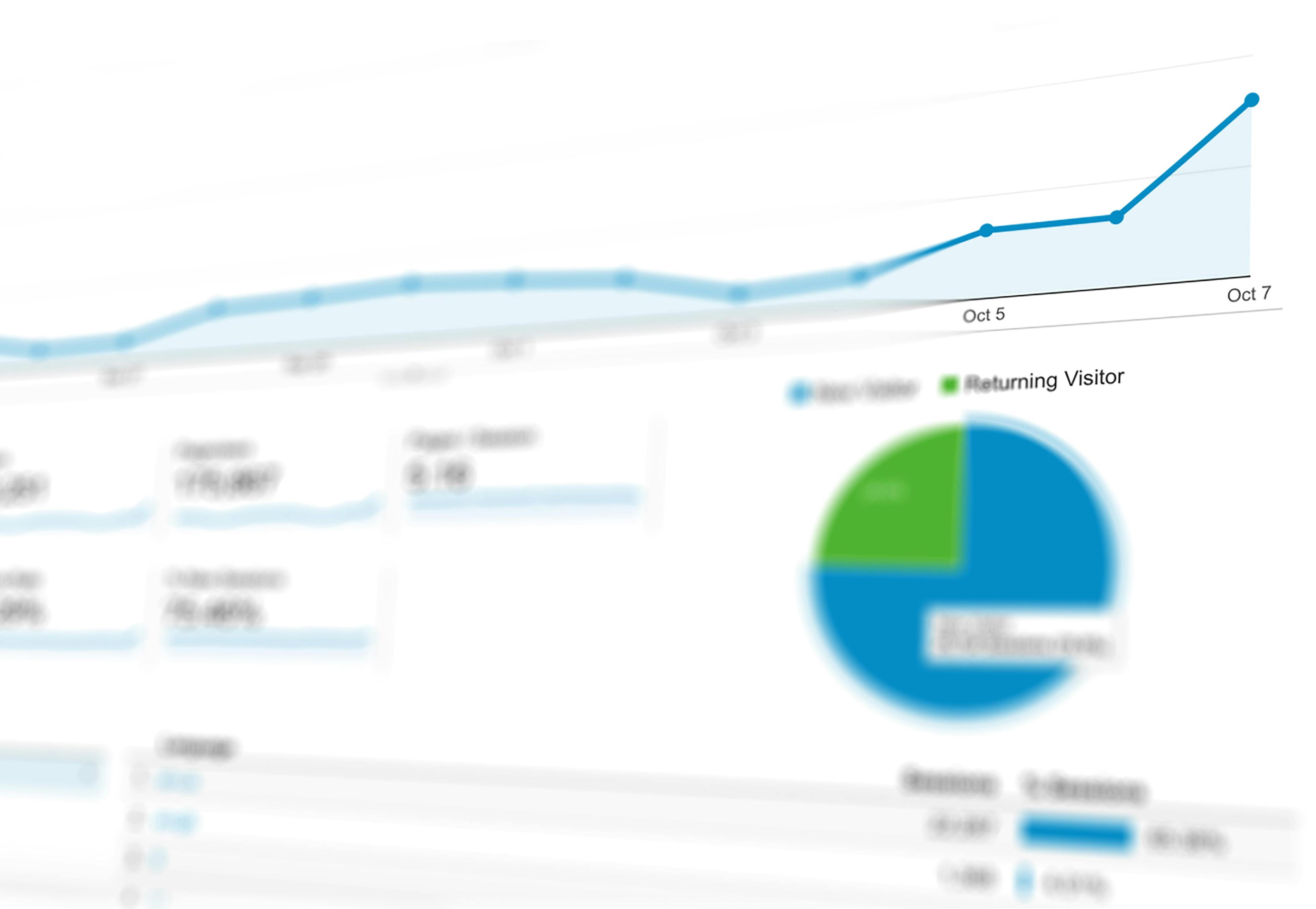
- Offer simple visualisations (heatmaps, time-spent curves, completion rates for routes).
- Make it easy to compare before/after when you change scenography, mediation, or digital tools.
5. How YOMU helps measure the impact of a visit
YOMU was designed from day one as a visitor app, but also as an analytics platform for museums. Concretely, the app allows you to:
- Track which artworks are scanned or consulted most often.
- Measure time spent on each content (text, audio, quiz).
- See which types of explanations work best (short vs long, playful vs expert).
- Analyse quiz results to understand what is well understood… and what is not.
On the YOMU web platform, teams can visualise:
- Heatmaps of visitor journeys within exhibitions.
- Engagement indicators (completion of routes, quiz participation, shares).
- Usage comparisons between different audiences or exhibitions.
The goal is not to track individuals, but to give teams near real-time feedback on what works – and what needs to be improved.
6. Where to start if you have nothing in place yet
If you feel you are starting from scratch, here is a simple three-step plan:
- Clarify your questions: what do you really want to understand? Young adult engagement? The relevance of a new route? The impact of a communication campaign?
- Identify your existing data: ticketing, surveys, staff observations, current digital tools.
- Add a digital mediation layer like YOMU to capture what happens at artwork level and throughout the visit.
Within a few months, you can move from a very global view (“we had 50,000 visitors”) to a much more granular one (“18–30 year olds return more often for this type of content, but drop off at this point in the route”).
Conclusion: measuring to better welcome visitors
Measuring the impact of a cultural visit is not about turning the museum into a KPI factory. It is about better understanding what visitors experience, so you can design more relevant, inclusive and memorable journeys.
Used wisely, data does not replace the intuition of curators and teams. It supports it, confirms it, or challenges it. And that is exactly where tools like YOMU can become powerful allies to imagine the visitor experiences of tomorrow.
- YOMU
- Analytics